A designer based in the Netherlands that I came across whilst browsing a creative blog. Really like the work he produces, someone I'd be very interested in contacting despite being based in the Netherlands.
Publication
Spaces and Places in between
Publication, poster and CD
A music based publication produced as a pack with a CD and trace printed poster. Really like the format used for the presentation of this publication and the use of type. Using the poster as a form of packaging, keeping the booklet and CD together is really interesting and the way the design on the trace interacts with the design beneath it on the cover of the book creates a really interesting aesthetic. The publication contains some really simple layouts with only a few hundred words and an image but it seems to work really well.
Identity
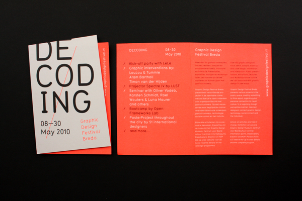
Graphic Design Festival, Breda
Identity, catalogue and event promo
Identity and catalogue for a graphic design festival in the Netherlands. Really strong yet incredibly simple visual mark, with an aesthetic running across all media. Love the use of the fold for the cover of the publications conextualising the mark and creating an interesting difference throughout the entire identity.
Dieuwertje Komen
Identity
Really simple identity for a photographer using a shape based around the negatives and visualisation of the photographers work. Again really simple but effective, colours used to give a slightly more feminine feel to the overall identity due to the photographer being female.


No comments:
Post a Comment