1. What skills have you developed through this module and how effectively do you think you have applied them?
I think the main skills I have developed up to this point have been software knowledge and in the initial stages of a brief surrounding ideas generation. Being able to put my ideas onto paper clearly so that I can work with them effectively. I have gained a good grounding in illustrator, a program I had never previously used and this has been really beneficial in terms of taking my ideas through from paper to digital outcome, and should really help with the onward development of my digital outcomes.
2. What approaches to/methods of research have you developed and how have they informed your design development process?
Research is one area in which I don't feel particularly confident as I find it is sometimes a process that almost becomes overlooked as I try to get into my design work as quickly as possible. Although throughout the continued use of the internet for blogging etc, I have been able to source and document a huge amount of what I would consider to be really effective and influential design which has informed and inspired my design practice. An example would be my type illustration for "No News is Good News" which was a technique I saw and wanted to try myself.
3. What strengths can you identify in your work and how have/will you capitalise on these?
I think the strengths of my work lie in using the software to bring together my ideas and illustrations digitally without taking away from the designs effectiveness. I plan to look a lot more into the process of vectoring hand rendered experiments as this has given me a really strong base to work on my ideas digitally in conjunction with my illustrated development.
4. What weaknesses can you identify in your work and how will you address these more fully?
The weaknesses in my work are definitely based around time management. Keeping up to date with my blogging can sometimes be a bit of an issue and also creating what I feel to be an adequate amount of development , that I am pleased with for a project. I think this just proves that you will always take the most critical view on your own work, and also that there is always improvements to be made. In terms of keeping up to date I will try to set myself amounts of work to complete each day so that I do not have to rush to complete something towards the end, as this can only be detrimental.
5. Identify five things that you will do differently next time and what do you expect to gain from doing these.
- Try to work in a range of media to hopefully give me a greater range of diversity in my outcomes and to maybe find techniques that I really enjoy working with.
- Use research on the internet and from the library etc as a tool to inform my practice much more, rather than something I often find becomes an afterthought.
- Try to make clearer connections between research and practice so that it is more obvious where my ideas may be coming from.
- Keep blogger up to date and stay on top of projects by setting a minimum amount of work so that I do not end up getting bogged down by briefs.
-Try to work initially by hand, developing a range of ideas, which I can then take forward digitally. As opposed to focusing on single ideas which often don't give much scope for further development.
Attendance- 4
Punctuality- 4
Motivation- 4
Commitment- 3
Quantity of work produced- 2
Quality of work produced- 3
Contribution to the group- 3

11.22.2010
11.21.2010
Mailshot Feedback 2.
What is being communicated & how?
Haiti suffering because of lack of clean water.
How well does this answer the brief?
Really quite well.
colours nice.
Typography quite nice but not overly readable.
Who is the audience and how well does the resolution communicate its message/content to them?
Everyone
What are the strengths of the resolution?
Colour
Image
How could it be improved?
A few ways.
General comments.
Flannegan & Moonpig
Mailshot Feedback 1.
What is being communicated & how?
3rd world countries (Haiti) need help after the earthquake.
How well does this answer the brief?
Very well
Colour scheme is great & stuck to 2 colours + stock
Very informative & interesting.
Who is the audience and how well does the resolution communicate its message/content to them?
People who can donate money, its message is well communicated & the colour scheme helps.
What are the strengths of the resolution?
The image and text work really well together visually. The blue colour is clear as it represents water.
How could it be improved?
Maybe a little more organic, and simple. Although it looks good, try to think about the subject rather than aesthetics.
General comments.
Overall its a successful piece of design. But again, think about the subject ( suffering, despare and organicness.)
Oli Cassell & Olivia Chapman


Message&delivery
FACT
142 killed & 1500 infected in Haitis cholera epedemic.
OPINION
Haiti is a country that needs aid/help
QUESTION
Will you help a country in need?
Who?
People with disposable income & people with the money to make a significant difference
What?
Item of direct mail that will inform them of Haitis situation... 142 killed&1500 infected in cholera epedemic.
Why?
In order to gain donations and aid for the country and also to meet the requirements of the brief.
How?
Mail shot making clear facts and figures of suffering in haiti.


11.19.2010
Third feedback for Posters.
What statement / fact / question is being communicated to you?
142 killed due to spread of unclean water.
Is this being communicated in a clear and focused way? [ Unsure ]
The fact being communicated is too small? It's not clear enough and not the main focus which I believe it should be...if not a bit bigger.
Have the posters been kept simple and to the point?, also is this a Fact, Question or statement? [ Yes ]
I do like the images - however the type & image one perhaps does not need the words 'Most are dying from...' as it is obvious from the fact. Slightly complicated message. losing impact.
Has the restrictions of the two colours plus stock been met? [ Yes ]
Are the two colours plus stock appropriate for the solution? [ Yes ]
Why are the two colours plus stock appropriate/inappropriate?
Appropriate. Maybe try black stock, white hands and text and blue water.
Do the posters work as a set or series? [ Yes ]
Why do they work / dont work as a part of a set series and could this be developed further?
The only one that doesn't work as effectively is the image one. Lacks something. Drops of water might be something you progress?
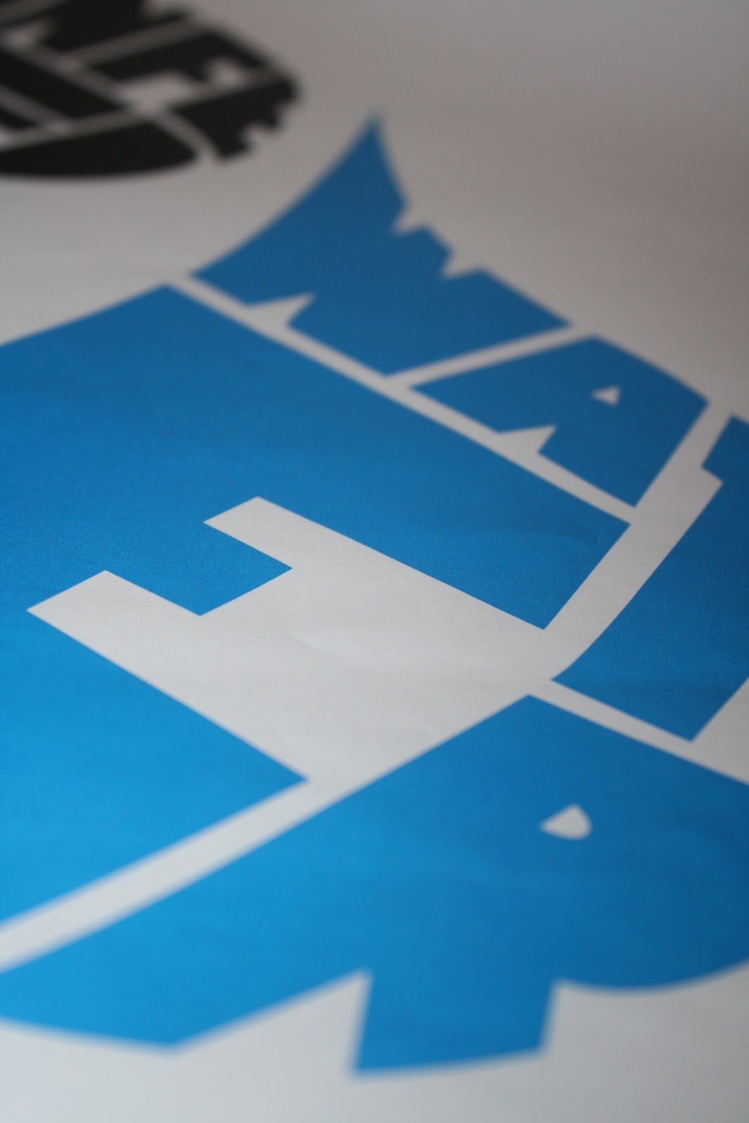
Is it clearly evident which poster is TYPE, IMAGE and TYPE & IMAGE?
Not as clear as it could be. the type only is confusing as to me... it looks like you've created image by manipulating the type.
Are the posters "memorable, immediate high impact and clear"?
Great impact from the image and strong use of colour. Think it works well - size of fact - could help too. and a smaller image
Do you feel the brief fulfilled to its full potential ? [ No ]
You have created a good set however with a few changes I think it could be even better.
Second feedback for Posters.
What statement / fact / question is being communicated to you?
About the lack of safe water.
Is this being communicated in a clear and focused way? [ Yes ]
But the text takes too much time to understand and read personally.
Have the posters been kept simple and to the point?, also is this a Fact, Question or statement? [ Yes ]
The posters are simple and keep to the point of the quote.
Has the restrictions of the two colours plus stock been met? [ Yes ]
Are the two colours plus stock appropriate for the solution? [ Yes ]
Why are the two colours plus stock appropriate/inappropriate?
I really like the colours used and instantly knew it ws water related which is good.
Do the posters work as a set or series? [ Yes ]
Why do they work / dont work as a part of a set series and could this be developed further?
They work well as a series. All keep the same colour and all stand out just as much so one doesn't over power the rest.
Is it clearly evident which poster is TYPE, IMAGE and TYPE & IMAGE?
Yes it's clear although the water droplets are becoming borderline image.
Are the posters "memorable, immediate high impact and clear"?
I feel the images are attractive and clear. But need to be more high impact as the seriousness of the issue isn't clear. I think it needs harsher images to relate to the quote.
Do you feel the brief fulfilled to its full potential ? [ Unsure ]
There is too much water in the posters sending the message that it's plentiful opposed to in lack of.
I do like the posters a lot and think they are attractive to look at, just the message needs to be clearer.
First feedback for Posters.
What statement / fact / question is being communicated to you?
142 killed & 1500 infected in haitis cholera epedemic
Is this being communicated in a clear and focused way? [ Yes ]
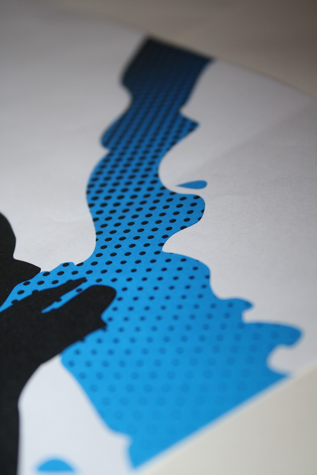
Interesting combination of type & image although I found it difficult to read the blue text - pouring into the hands.
Have the posters been kept simple and to the point?, also is this a Fact, Question or statement? [ Yes ]
There is a clear relation to the subject through both type and image.
Have the restrictions of two colours plus stock been met? [ Yes ]
Are the two colours plus stock appropriate for the solution? [ Yes ]
Why are the colours appropriate/inappropriate?
Black symbolising infection & blue - clear relation to water. Do the posters work as a set or series? [ Yes ]
Why do they work / don't work as a part of a set series and could this be developed further?
I think they do work as as a set, colour is kept consistent aswell as style. Is it clearly evident which poster is TYPE, IMAGE and TYPE & IMAGE?
It is quite clear although the type poster could also be seen as an image aswell ?
Are the posters "memorable, immediate high impact and clear"?
The combination of type and image reminds me of some posters advertising places to visit in London . I think that the message is being clearly conveyed throughout all three posters.
Do you feel the brief fulfilled to its full potential ? [ Yes ]
The only thing I would consider changing would be the type in the water, maybe make the first letter of each word slightly larger or play around with lowercase.
Statements of fact&image opinion
Statement of fact.
142 killed & 1500 infected in haitis cholera epedemic.
Statement of opinion.
Haiti is a country in need
A country that doesn't deserve such suffering.
142 killed & 1500 infected in haitis cholera epedemic.
Statement of opinion.
Haiti is a country in need
A country that doesn't deserve such suffering.
Subscribe to:
Posts (Atom)