They chose the brief subject "Get people to read more" and had a fluid and concise presentation with an effective outcome- whereupon they used stencils to create a typographic flour pattern on pavements- attracting passers by as a temporary arts piece.
This is a brief summary of the feedback we gave after watching their presentation and analysing their blogs collectively...
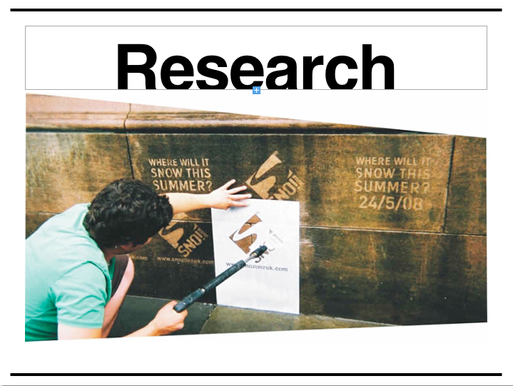
-Good research and linking design practice to design context in blogs.
-Existing poster layouts, quotes and type- good considerations for the brief.
-Looked at text within the environment, but would benefit from gauging responses for a more defined view of how effective their outcome was. It was proven to make people read- but did it inspire them to do so more frequently after wards?
-Specific research to product outcome evident on blogs- though could perhaps elaborate on this development a little more- go out there and create the designs as opposed to just talking about them (though we understand time is limited).
-Good planning and research- perhaps, however, a little too negative. Statistics and solid quantitative research would increase the believability and truth that people don't in fact read (if this is in fact the case).
-Good distribution and communication as a live brief, but perhaps make a more permanent source for their project- getting to physically read up tips, advice etc- a follow-on from what you are already doing. Perhaps adding a reading list to create examples of what people could be reading- the quotes were not specifically catered for an audience.
-Good development of work on design practice blogs.
-Consider where you present the work- perhaps make it a little more scenic and less vulnerable to wearing (potentially increasing the amount of people that would see it, therefore, increase it's effectiveness)- a place where people would walk, but not walk over it.
-Good method of delivery with the postcards- a bridge between the temporary and the permanent.