5.29.2013
5.16.2013
Personal Stationary Mock up

Mock up of personal stationary developed with new identity. Ideally would like the cards to be printed on GF Smith with black foil for the logo and white text. The letters I have done were printed on Arjo Wiggins recycled stock.
5.14.2013
Contact with Qubik
After sending a tube with some posters in to Joe and calling the studio, Joe got back to my e-mail with some really detailed answers.

Firstly, How would you describe the work that you produce? and is there a project that you think sums up qubik?
I guess the work that sums up what I do the most is the Chromatologies identity and fold-out poster I designed in 2010. I’m still really happy with how that project turned out. The design solution is typographically-led, making a clear, but oblique reference to the study of colour. Key to the poster’s success in my opinion is also the use of materials. I sourced a stock called Chromalux from Fedrigoni which is gloss coated on one side and uncoated on the other. The gloss reproduces the bright colours really well and all the information relating to the festival is printed in black and white on the reverse.
When studying/ starting your career in design, who were you influenced by?
I studied in the 80s and to be honest I didn’t really know of any other designers apart from Peter Saville — through records I’d bought on Factory. Later in the late 90s I was really influenced by the work of The Designer’s Republic quite a bit.
Is it the same people you’re influenced by now or have you found new influences? if so who are these new influences?
No I’m really not influenced by those designers any more. I think my taste got more mature after this and I was drawn especially to Dutch designers like Karel Martens. I really admire the work that comes out of Werkplaats Typografie, it seems consistently free and engaging. There are so many designers who I like right now, James Langdon is an inspiration, also the font designer Radim Pesko.
Of the projects you’ve done, Which do you think was your favourite or most effectively answered the brief? and most importantly, why?
Hmm same answer as 1. I guess. It uses the concept of chromatology in not such a direct way, I mean without forcing or illustrating the idea too much. Chromatology is the study of colour. I decided that filling all the text with a continuous colour gradient was a really nice way of answering the brief.
What is your view of the phrase Form Follows Function? do you think it is relevant in design today or outdated, and why?
It ought to be relevant I think. Our role as designers is to communicate ideas using a mixture of type, graphics, images, materials and of course form. All of these are equally important to communicating the message. I like a lot of contemporary design, especially this aesthetic which I describe as ‘amateur’. It’s actually quite difficult to achieve in principle, to be free enough and make something look amateur but also well designed. Some designers are better that others. But I worry that pretty soon it will look outdated. Most of the design I really admire is perhaps a little boring, but it will probably stand the test of time and will still look fresh in the future.
Finally, what are your influences outside of design that you think have an effect on your practice?
I have interests in art and music. I have an art practice and I read a lot about art. I listen to a lot of electronic music and am interested in the history of electronic music and also current experimental practices. I am generally drawn to experimental media be it film, literature, art or music. I like things that push and test boundaries. My favourite book is Finnegans Wake by James Joyce — probably the most difficult book ever written. I come across things like that and I am intrigued by it, I want to figure it out, to experience something totally original and new.
Unexpected - Contact with Design Project

After sending out context letters along with some posters I got this response from Design Project which I did not expect at all. Amazing.
Andy the director then got back to me with some brilliant answers to the questions I sent over.
- Firstly, How would you describe the work that Design Project produce? and do you think there is a project that you think sums up the studio?
Its always difficult to describe your own work, but I'd say our approach is very much centred around clear, articulate communication with a modern typographic approach.
I'm not sure any one project sums up the studio, as each project has its own particular design problem and subsequently this drives the appropriate solution.
Every element of a project is considered; colour, language, format, production - the common thread running through this, is that everything is born out of research and a complete understanding of the individual clients requirements.
- When studying/ starting your career in design, who were you influenced by?
I remember seeing the early work of Why Not Associates - the Next Directory catalogues they produced in the early 1990s, seemed to look very different at the time.
Also the work by Siobhan Keaney had an influence on my early work.
The word 'website' didn't exist when I was a college, so you had to look harder for reference points by searching the library or looking at current design magazines that were available at the time.
The book 'Typography Now' seemed to be the big thing when I was studying.
- Is it the same people you're influenced by now or have you found new influences? if so who are these new influences?
My influences have definitely changed since the early days studying and starting my career as a designer.
Design influences over the years have included: Josef Muller-Brockmann, Richard Paul Lohse, Helmut Schmid, Otl Aicher, Emil Ruder, Ken Garland, Milton Glaser, Total Design... the list goes on.
Although I don't tend to always look at designers and find influence from other sources like the arts and music. I even collect out of print ephemera (which spans a whole host of topics).
- Of the projects you've done, Which do you think was your favourite or most effectively answered the brief? and most importantly, why ?
Again a very difficult question to answer, but I'd probably say the Re-Bag project, curated by Progress Packaging.
This was all encompassing as a project and involved creating branding and communications to initially promote an exhibition held in London (promotional items, printed matter, packaging, exhibition branding and onscreen graphics).
The project was all about sustainability and the environment - and how by designing graphics for a canvas bag could help create a mindset to encourage reusability.
Our approach to this project seemed to tick all the right boxes when it comes to reusability - from designing a promotional bag (which could be used prior to the event - almost like ambient advertising) to creating clamshell packaging boxes which house each contributors bag as well as doubling up as a frame to display the bags at the exhibition. The catalogue also had an 'unfinished feel' about it with untrimmed pages and exposed binding - hinting at the fact that production processes were kept to a minimum.
The project is still talked about and bags are still requested even today - 6 years after the event took place (but sadly sold out).
- What is your view of the phrase Form Follows Function? do you think it is relevant in design today or outdated, and why?
I'd say, Form Follows Function is very relevant across all design mediums - the physical form and functionality of a piece of communication (from a graphic design perspective) go hand in hand.
Its also a process that needs to continually adapt depending on the specific design problem and requirement.
- Finally, what are your influences outside of design that you think have an effect on your practice?
I'd say we have quite a few influences outside the boundaries of graphic design which range from; music, art, architecture, fashion, film, furniture and photography.
5.08.2013
Contact with Hey Studio - Barcelona
After sending out a tube to Hey in Barcelona, I then e-mailed them to follow up the stuff I'd sent. Veronica the director got back to me really quickly.

I then e-mailed again and organised a conversation on skype. Veronica was really helpful despite being busy and gave loads of her time! Below is the conversation we had on skype.
How did you start your career in design? did you study?
Yes I studied graphic design and a few years later a typography degree
Where did you study?
in Barcelona in Elisava university and the degree in Eina also in Barcelona
And when you were studying, did you have any particular designers or studios that influenced you?
Yes some but not a lot I was very ignorant that time
I remember being fun of Vince frost then when I started to work I started to explore in graphic design and know the past ages.
All the graphic design in 1960-1970 around the world. When I was studying i liked to result the design projects very simply
I discover a world in that decades
Were your influences mainly Modernist?
Yes, I prefer to look past more than the present. I have a large collection of vintage books
Any particular designers like Crouwel for example?
ikko tanaka, this is my favourite. and of course saul bass, armin hofmann...a lot...
How would you describe the work you produce at hey?
it is simple and we love to resolve it with geometry and powerful shapes
How many of you work at hey?
we are 3
What is your view on the phrase form follows function? do you think it is an outdated phrase or is still relevant and why?
Yes I think first is the idea and then the form
is 50-50
When you have a particular style you focus in that style and it’s easier that no means that is faster
Of the projects you’ve done at Hey, which was your favourite? or do you think was most succesful?
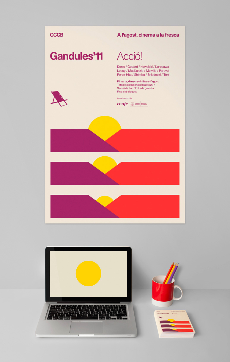
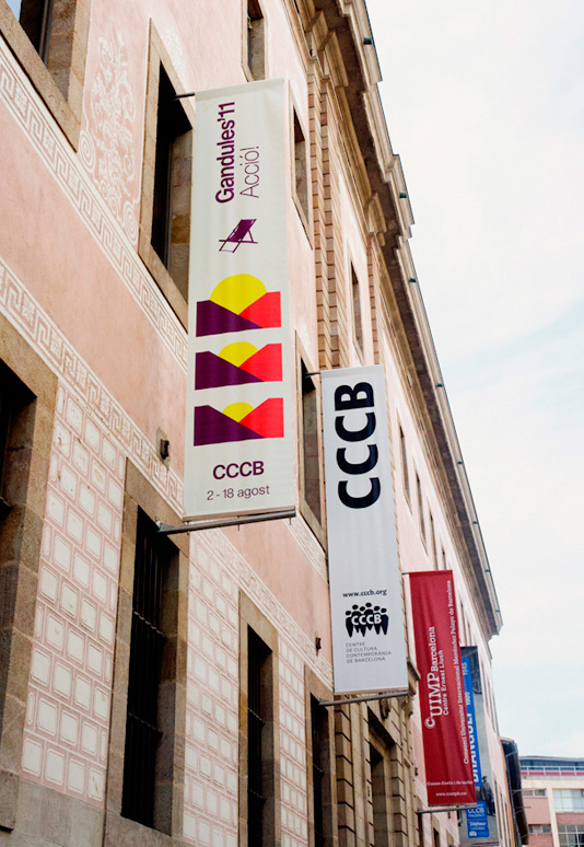
It is difficult to say one, I like all the series from Gandules and also Film Commission Chile
What is about them you think worked? and were they influenced by anything in particular?
Gandules because is based in a theme that changes every year. it is a small festival in the CCCB and we try to solve in a syntesis way
the second because was our first big identity project
What influences you outside of design? and how does it affect the design you do?
I think we are influences in everything we do
not only graphic design
Is super important to have your own like with distance from graphic design.
a normal day life.

I then e-mailed again and organised a conversation on skype. Veronica was really helpful despite being busy and gave loads of her time! Below is the conversation we had on skype.
How did you start your career in design? did you study?
Yes I studied graphic design and a few years later a typography degree
Where did you study?
in Barcelona in Elisava university and the degree in Eina also in Barcelona
And when you were studying, did you have any particular designers or studios that influenced you?
Yes some but not a lot I was very ignorant that time
I remember being fun of Vince frost then when I started to work I started to explore in graphic design and know the past ages.
All the graphic design in 1960-1970 around the world. When I was studying i liked to result the design projects very simply
I discover a world in that decades
Were your influences mainly Modernist?
Yes, I prefer to look past more than the present. I have a large collection of vintage books
Any particular designers like Crouwel for example?
ikko tanaka, this is my favourite. and of course saul bass, armin hofmann...a lot...
How would you describe the work you produce at hey?
it is simple and we love to resolve it with geometry and powerful shapes
How many of you work at hey?
we are 3
What is your view on the phrase form follows function? do you think it is an outdated phrase or is still relevant and why?
Yes I think first is the idea and then the form
is 50-50
When you have a particular style you focus in that style and it’s easier that no means that is faster
Of the projects you’ve done at Hey, which was your favourite? or do you think was most succesful?
It is difficult to say one, I like all the series from Gandules and also Film Commission Chile
What is about them you think worked? and were they influenced by anything in particular?
Gandules because is based in a theme that changes every year. it is a small festival in the CCCB and we try to solve in a syntesis way
the second because was our first big identity project
What influences you outside of design? and how does it affect the design you do?
I think we are influences in everything we do
not only graphic design
Is super important to have your own like with distance from graphic design.
a normal day life.
5.03.2013
Revised Identity.


Revised identity, going for a much simpler mark than my original word mark which was just my name. Thought the link to magnesium could be something to work with later on, however still needs thinking on. Much more pleased with this and think it is more in line with my work than my previous identity.
Sending Tubes to studios.
I picked out 5 studios that I really wanted replies from for my design context publication. Although I wasn't sending many out, I was hoping that by tailoring my mail outs to each studio it might be a little more productive in terms of responses.


Some awful picture of the tubes I sent out. Each tube had a letter and posters from Form and writing done in the last module. Hopefully sending them a range of things will get their attention.


Some awful picture of the tubes I sent out. Each tube had a letter and posters from Form and writing done in the last module. Hopefully sending them a range of things will get their attention.
5.01.2013


Design Project
Oblong Furniture
Identity & promo


Robert Horne Group
Publication


Bryan & Laura Davies
Publication


Design Project are a studio in Leeds that produce exactly the kind of work that I want to produce, and think their work is in a similar vane to the kind of work I'm producing. Really clean and uncluttered typography and clever use of colour and stock make their work. Another studio I'd be really interested in contacting for my context publication.
Design Project
Heydays
Filmfaktisk
Identity


Heydays in Oslo, working on briefs for the cultural sector with massive success. Will be contacting these for my context publication as their work always seems to answer the brief perfectly and they consistently develop really clever and engaging identities. Their insight into branding and opinions would be really awesome to get for my context publication.
Heydays
Identity
Heydays in Oslo, working on briefs for the cultural sector with massive success. Will be contacting these for my context publication as their work always seems to answer the brief perfectly and they consistently develop really clever and engaging identities. Their insight into branding and opinions would be really awesome to get for my context publication.
Heydays
Qubik
Avoid -Lumen
Invitation


Ultrasound
poster & event programme


Love Qubiks work and will definitely look to contact Joe for my context publication as I think he'd have a really interesting opinion and would probably be likely to reply. The work is so simple yet every project has a clever device that really makes it. Also really simple use of bold colour makes their work stand out from others. Works in exactly the realm of industry that I am interested in working in and I think his insight might really help.
Qubik
Subscribe to:
Posts (Atom)