6.07.2012

Domain Search


found that there is an abundance of domains available with my name, most notably mgregorydesign.co.uk, so might have to get on with this soon

6.06.2012

6.05.2012

Tumblr

I've had this tumblr set up for a while but never posted as I'd no idea how it worked. Decided to give it a go and post some of my work on from the past few years. Maybe I'd learn a thing or two about tumblr whilst I did it.


Really quite like some of the layouts on Tumblr... went for a simple three column grid layout that I felt gave a nice balance between type and image.

http://maxgregorydesign.tumblr.com/

Business cards.


Variations of my business card, using the logo type previously developed along with other, necessary information for a business card. These show mainly variations in colour and font, however I would like my card to be white ink onto coloured or black stock so these are simply ideas.

Above on the left are some samples I printed just to check that the point size and alignment were all in order. From this I concluded that all was in order and on the right is a screen print of my business cards onto newsprint. This was just a print I did to loosen up the ink on the screens however I then went on to produce the actual business cards.

Setting up the screen


Pictures from setting the screen up... edgy exposing shot.

Cutting the cards


6.04.2012

OUGD203 Evaluation.


Product Range Distribution final crit.

From new crit group.
-Rationale more defined and clearer
-Product/range/distribution boards will give you indication of where you are at the moment and how to expand on the range 
-Lots of development but needs direction > develop a range
- Amazing visual heirarchy
- BLOG!
-----
-Overall v.nice visuals
-However, heirarchy on A2/SW/HK needs work
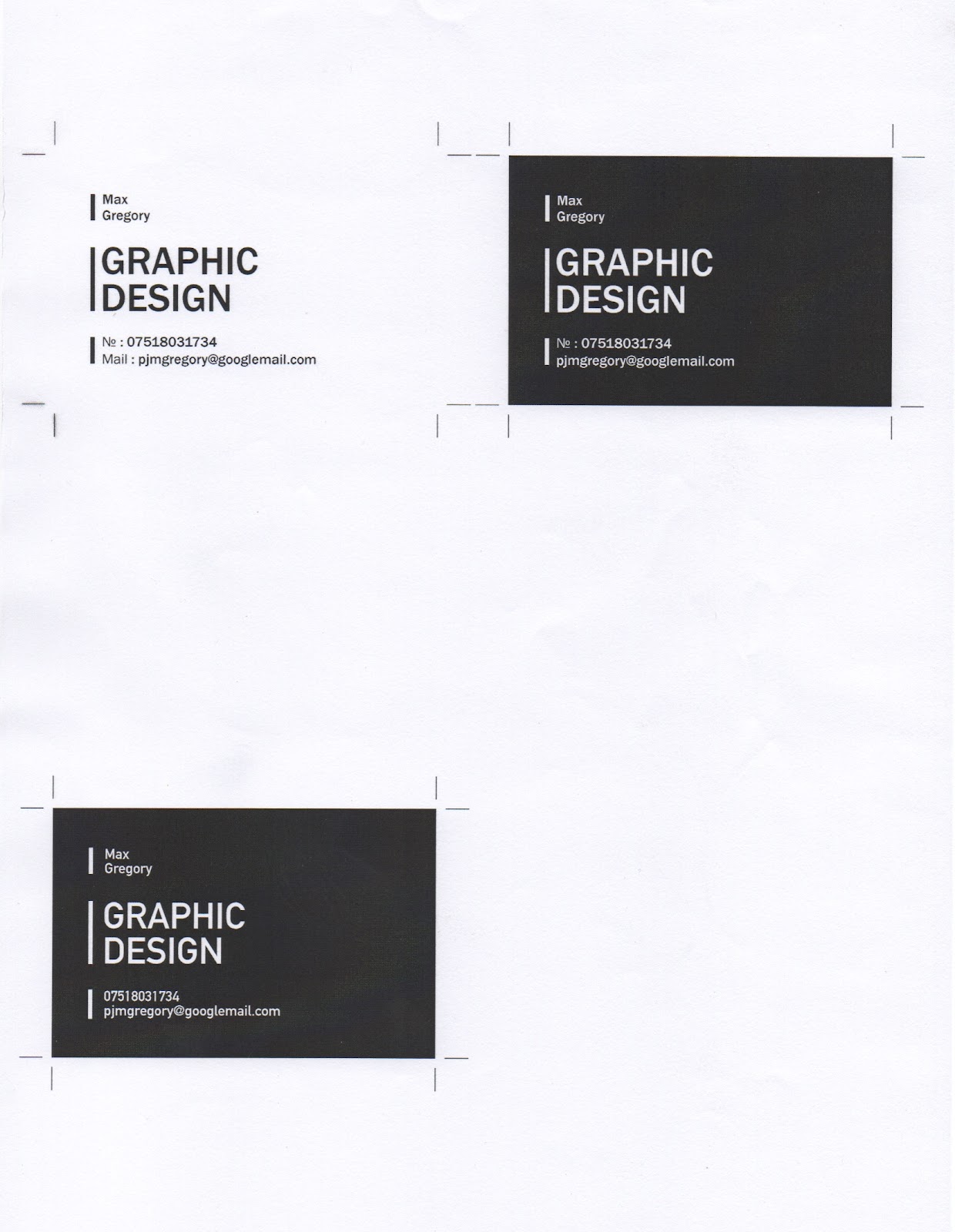
-Love the tickets & flyers
maybe keep the posters consistent to that look.


From previous crit group.

Peer Feedback1

Product, Range, Proposal
Strengths
Excellent range of typographic posters
Areas for Improvement 
Are you designing for the exhibition space? Are you doing more than posters?

Design Development
Strengths 
The Typografia identity is incredibly strong, unique and recognisable
Areas for Improvement 
Will there be any web aspects of it.

Visual Quality
Strengths 
Strong colours, consistent throughout
The Swiss style is a classic style with a modern twist, something that your target audience will appreciate

Peer Feedback2

Product, Range Proposal 
Strengths 
Posters are really informative & clear.
Areas for Improvement 
Maybe produce a publication to hand out at the event
-Web assets
- Digital posters/ads on tube - Kinetic type?

Design Development
Strengths
The new logo works really well - kept it interesting yet more understandable
- general design & layout of all posters work really well
  
Visual Quality 
Strengths
Good colour scheme
- Tickets are consistent with branding
- Like the pale blue/purple/indigo/lilac colour as well - use it!  
Areas for Improvement 
- try inverting the colours on the green posters
stick with red & green for colour scheme - very nice!
- keep to one colour plus stock

Overall a pretty interesting and useful crit but it has uncovered just how much work I have left to do. Althought I have done masses of visual experiments with the logo, colour ways and information on posters, flyers and tickets, as of yet there is no coherent body of work.
I also need to branch out further in order to give a more rounded range of promotion and collateral for an exhibtion. Finally is the issue of printing, whether I propose the majority or work toward sourcing print from outside of college because of the incredibly busy print room, and the use of printing techniques on my work that will not be possible downstairs. Most notably - digital white ink.
Screenprinting may be an option but with the tight deadline I think it may be a very rushed and, because of the range of goods, extremely expensive process. This will need to be a decision I make pretty sharpish if I decide screenprinting is the way I want to go with it. But the white on coloured stock printing I feel is intrinsic to the identity I have created and would fail without.

Product Range Distribution presentation boards


Product Range Distribution product shots.


Product Range Distribution exhibition catalogue

Catalogue covers.


Catalogue Spreads.

Product Range Distribution flyers.


Product Range Distribution typeface flyers


Product Range Distribution Talk posters


Product Range Distribution tickets.


Product Range Distribution Progress crit

With only a week remaining until the final crit for this brief, we had a crit with the same groups as last weeks to look at the progress we'd made since then. To focus the feedback we were receiving, we first wrote 3 questions that allowed peers to address any issues you had without you having to be there.


Do either of the names I suggested work? if so which one is best/most effective and should they be accompanied by an explanatory paragraph in order to communicate more effectively? 

Is an aesthetic based around helvetica the right choice or should I focus on a range of/variation in typeface? 

Is Focusing on 10 typefaces the right way to go for the exhibition or should the contributing artists remain the focus? 


Peer Feedback1

Problem Analysis


Design Development
Makes sense to use helvetica, but it might be nice to vary typefaces, use helvetica as the main typeface (logo) and others on posters to give a broader range etc.

Audience/Context 
People would be more attracted to the exhibtion by the typefaces, they wouldn't necessarily know of the designers.

Product & Proposal
Immovable type fits the event better - suggestive - whereas...the other one, if I saw that I would be like, WHAAAAAT IS THIS. I do like the name though. The other promotes interest as it is unique

Peer Feedback2

Problem analysis
Strengths
- Thought about designers to be used in the exhibition.
Areas for improvement 
-How would you get people interested in type?

Design Development 
Strengths 
- Helvetica logo works as it is internationally recognised.
Areas for improvement 
- Colour scheme/typefaces/stock etc.
(if you're not just using helvetica)
- Look at a sub typeface for the body copy, to compliment helvetica

Audience/context 
Strengths 
- potential for a narrowed audience
 Areas for improvement 
- Who is targeted and how will you appeal to them
- Where is your design going to be placed? any mailouts? online presence ?

Product & Proposal 
Strengths 
- Research gives us an idea where it's going
Areas for improvement
- Needs more clarity
- Would you create all these things? entrance display?

Product Range Distribution brief.

Brief 

To create and provide a visual identity for a typographic exhibition, sponsored by the typographic circle, about the history of a number of classic typefaces that have remained prominent throughout their history.

Background / Considerations

The Typographic Circle was formed in 1976 to bring together anyone with an interest in type and typography. They are a not-for-profit organisation run entirely by volunteers who stage a variety of type and typography related events including a series of diverse monthly lectures by well-known industry speakers, and the annual New York Type Directors Club exhibition.

Mandatory requirements

The event should bring together a number of the Typographic Circles speakers and provide a basis for both people with a passion for type and those entirely new to it.
Ensure that the material created will appeal to anyone with an interest in the creative industries.
Consider the use of type as a main element to the exhibitions branding and think about how it can be applied to all elements of the events identity.
Look at how types history can be conveyed using the identity and how it can be made to appeal to anyone who sees it. 

Deliverables

Full identity and exhibition collateral including:
- Logotype
- Promotional posters
- Flyers
- Tickets
- Exhibition signage
- Exhibition catalogue
- Special Edition talk prints & exhibition material. 
- Postcards

Development of a website.

Studios to contact.

a list of studios to contact prior to Niall and I going to San Francisco over summer.

Manual Creative 
manualcreative.com

2325 3rd Street, Suite 319
San Francisco, California, 94107
Phone +1 415 932 6369


Noon
www.designatnoon.com

2180 Bryant Street, Suite 204
San Francisco
California 94110
T: 415.621.4922
F: 415.621.4923


Tolleson Design  
tolleson.com

560 Pacific Avenue
San Francisco, CA 94133
T 415 626 7796

Voice Box Creative
www.voiceboxcreative.com

Voicebox Creative, Inc.
250 Sutter Street, Suite 450
San Francisco, CA 94108

Pentagram SF
www.pentagram.com


220 Montgomery St. #865
San Francisco, CA 94104
T +415 398-4063
E  info@pentagram.com


Cahan & Associates
www.cahanassociates.com

171 second street, fifth floor 
San Francisco, CA 94105
415-621-0915

Mine SF
www.minesf.com

190 Putnam Street,
San Francisco, California 94110

Office
www.visitoffice.com


1060 Capp Street
San Francisco CA 94110


Dowling Duncan
www.dowlingduncan.com


466 Geary Street
Suite 500, San Francisco
CA 94102 USA
T +1 415 546 1399

Mash Creative calenders

Task 3 
Mash Creative
calendar.

Interesting way of getting their work out, Mash Creative produce a limited edition calender annually. This is good for someone like Mash, with a creative following as limited edition prints of theirs will have a lot of value, whereas a limited edition print for someone just starting out, like myself, may be much less. However it's an interesting thought, something like a calendar, that can be mailed out directly, still showing your style of work, but with a practical application.


2012


2011 


2010


Strengths : Really creative, yet practical so remains interesting for people seeing it.
Weaknesses : possibly wouldn't have the appeal when produced by someone starting out.
Opportunities : opportunity created for collaboration with those it's sent to.
Threats : could be copied... and possibility with mail out that it may never be used.

QUS QUS mailer.

Task 3 
QUS QUS
self promo mail out.

I've posted this before however I think it's more relevant here. This is a really interesting mailer from QUS QUS, making use of a limited colour palette, just two colours. Monotone images link into the colour scheme from the website whilst still giving people receiving the mail out a good idea of the kind of work that the studio is producing. This is a fairly standard format for a mailer however I still think it works well and would make people interested.


Strenghts : Fairly cheap production due to limited colour palette and standard format.
Weaknesses : possibly the images in this monotone format don't have the detail of the original
standard format could mean that it is not looked at in the way it is intended.
Opportunities : Will provide work and gives the opportunity for a lot of information to be put across in a small space.
Threats : Could not be viewed fully or as intended and could give the opportunity for copying.

Toormix - 11 year promo posters

Task 3 
Toormix
11 year posters.

Really nice series of posters by Toormix celebrating their 11 years as a studio, similarly to Mash Creative this is an item that fans of the studio would hold in high regard, whereas someone just starting out would be of a little less value. Colours match the website and the branding toormix already have and the posters work on their own as much as in a series.


Strengths : Really interesting visually, and work as a series of limited prints that would promote the work of the studio without being too pushy on potential clients.
Weaknesses : possibly wouldn't be seen by potential clients rather than fans of the studio.
Opportunities : provide work from posters sent out and also would work as portfolio pieces
on their own.
Threats : Always possibility that work could be used by anyone seeing the poster. Also might not necessarily say everything I want it to about myself.