Showing posts with label Good is.... Show all posts

12.08.2011

Final Good is...


Open publication - Free publishing - More editorial
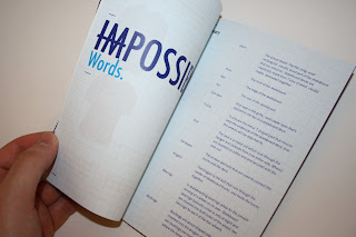
 Logo development for Impossible Skateboards.

Open publication - Free publishing - More graphic design
The finished product manual.

Open publication - Free publishing - More graphic design
Presentation boards for submission.

A few photos of my final produced products. I am pleased with the outcomes of this brief although I know with slightly more efficient time management I could have pushed it further. I am most dissapointed about not being able to screen print some mock up boards, especially after paying for and preparing a screen only to find it wasn't correctly exposed. I think having some mock ups of actual product could have really rounded off the brief. 


11.22.2011

OUGD201 self evaluation

1.  What skills have you developed through this module and how effectively do you think you have applied them?
Throughout this module I think I’ve developed in my ability to use colour within my design work, applying everything we’ve learnt about production for print fairly effectively in order to achieve some interesting results. I think I have also benefited from the type sessions, the skills from which I have been able to apply to any typographic layouts throughout this module. I think this will prove invaluable as I progress further into the course. Finally, the main thing I can take away from this module is a much greater appreciation for commercial print, both in the preparation of the design for print and in the processes themselves. Another skill I feel will prove invaluable moving forward.

2.  What approaches to/methods of print production have you developed and how have they informed your design development process?
I think throughout this module I have had much more of an appreciation for the print production processes that I want to apply to my outcomes. Despite a lot of them not being available in college I was able to propose what I wanted and think about visuals before actually printing.Working with ideas on screen allowed me to be more creative when thinking about the resulting outcomes.


3. What strengths can you identify in your work and how have/will you capitalise on these?

I think the main strength I can identify in my work for this module is visual consistency, and in branding this is very useful. I have been pleased with the majority of the artwork I’ve created and in how it has come together to make a whole body of products for the main brief. I think I can capitalise on this for any brief as it is usually important to have consistent visuals for a single body of design. 


4. What weaknesses can you identify in your work and how will you address these in the future? 

I think the main weakness I can identify through this module is hand rendered work and my ability to work at a consistent pace throughout. I find that my motivation is unevenly spread throughout the module and seems to come into play towards the end of the module when the pressure is on. If I were working at a more consistent rate, giving myself daily goals to work towards I think I’d more likely get a more rounded body of work. 


5. Identify 5 things that you will do differently next time and what you expect to gain from doing these.
-       Try to stay motivated throughout the brief by setting myself regular goals and things to achieve in a restricted time. This will make me get on with the work earlier as I find that when I write to do lists I have more motivation.
-       Try to be decisive in the early stages to save myself from falling behind whilst deciding on concept.
-       Try to blog as soon as I do things in order to prevent work from piling up towards the end of the module when I could and should be getting on with more important elements of a brief.
-       Plan ahead in order to allow myself time to produce what I want to, for example preparing my screen earlier in screen print so that if anything should go wrong with it, it isn’t the day before the module hand in…
-       Use research more effectively in order to gain more extensive knowledge of printing processes and also processes available around college. This will allow me to plan my time better in order to fit in the processes I want, think before the production in order to book inductions/get drop-in when using college resources. 
   
6. How would you grade yourself on the following areas ?

Attendance     5
Punctuality    5
motivation     3
commitment   4
quantity of work produced     3
quality of work produced     3
contribution to the group     4

10.31.2011

Good is... rationale, rewritten.

Good is the feeling that nothing is impossible when skateboarding.


Why?
1.Can go into anything without fear
2. It helped man to achieve great things.
3. Skateboarding would not be where it is now without it.
4. It's a natural high
5. Could make you look really cool.


I intend to promote to a group of skateboarders between the ages of 7 & 47 that nothing is impossible. In order to achieve this I will produce...

Product
Branding & promotion/ design and a fictional event for the brand launch/

Range 
Logo/board designs/promotional material for brand & event/stickers/hardware design.

Context 
The brand will exist as a whole, however the event exists as a promotional catalyst for the brand. This should allow it to be seen by as many of my target audience as possible.

10.21.2011

Good is concept crit

PEER FEEDBACK

Comment on the extent to which initial research and development of the concept demonstrates a significant understanding of the chosen subject matter.
Initial research is good, a lot of content to work with, think the concept needs to be rethought to be more focused, too vague at the moment. Does it need to be specific to skateboarding?


satisfactory - good

Comment on the extent to which the concept proposal exploits the practical and conceptual investigation and application of design for print.
There is a lot of ways in which you can apply print with this. Organising promotion for an event, skateboard designs. Once you have a more focused concept, it'll be easier to find out what you can work with.

good


Comment on the proposed range of products to be produced in response to a clearly identified problem.
Linking to an event is a good idea, (festivals), places where people feel free! ie festival promotions - large scale, applied to various things (pad printing) posters flyers, mailshots...


satisfactory - good


Additional comments 
Focus your design ideas around an event.
Research in depth how to print onto skateboards, wheels etc - if not possible for you to do, mock up on photoshop. Try printing onto vinyl and then sticking on...
Strayed away from 'Nothing is impossible' back to skateboards
Event focusing on that statement - extreme sports - being spontaneous - sports clothing?


Think this was a really useful crit and have discovered I should probably move away from making happy meal packaging and focus on some actual design. I think going with a different colour scheme, one of the earlier ones making use of a teal blue or blue background with grey bolt would be much more effective.

10.19.2011

Good is...? concept crit 1

Strengths
Skateboarding - good idea for branding/printing (onto boards etc)
Strong logo.

Areas for improvement
More focus for ideas
Statement and product need to be linked and communicated more securely to the audience. (at the moment, needs to be explained)
Whats your specific audience?

Safety wise
Should you be advertising extreme sports to young people.

Additional comments
Think of alternatives to the product that you can promote - made up events etc...
opens up possibilities for different promotional material.
Look at extreme sports magazines
Look at the strong man competitions, spartan race etc.
Research printing onto boards and wheels etc but just mock it up/ focus on do-able range of deliverables.

10.16.2011

Wrap it up crit feedback

Strengths
- Good creating quality.
- Carton is well composed, the idea of reversing the orientation really is a different take.
- Logo image is very strong.
- Upside down type is a good idea for helping contextualize the logo.

Areas for improvement
- MacDonald's colour scheme needs readressing slightly.
- Look at the inside of the packaging, how can that be changed?
- Type on carton would work better if it only went across three panels.
- Font is like Macdonalds...

Really useful feedback that helped me to pick out some issues that definitely need addressing.

Good is rationale

Good is the feeling that nothing is impossible.


Why?
1.Can go into anything without fear
2.Gives determination & motivation to achieve
3.Without it, masses of information would be undiscovered
4.It's a natural high
5.Gives people faith


I intend to promote to a group of skateboarders between the ages of 15 & 45 that nothing is impossible. In order to achieve this I will produce...

Product
Branding & promotion for a skateboarding hardware company

Range 
Packaging // decks // product aesthetic // logo // posters // editorial adverts // t-shirts etc

Context 
Skateshops - skate magazines - on products.