
QUS QUS
self promo mail out.
I've posted this before however I think it's more relevant here. This is a really interesting mailer from QUS QUS, making use of a limited colour palette, just two colours. Monotone images link into the colour scheme from the website whilst still giving people receiving the mail out a good idea of the kind of work that the studio is producing. This is a fairly standard format for a mailer however I still think it works well and would make people interested.


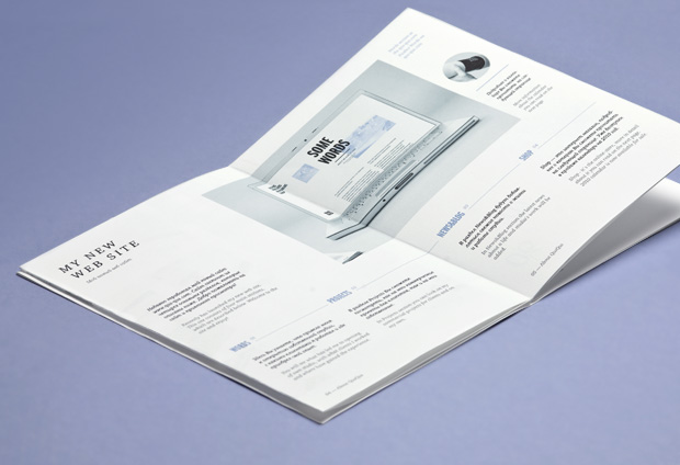


Strenghts : Fairly cheap production due to limited colour palette and standard format.
Weaknesses : possibly the images in this monotone format don't have the detail of the original
standard format could mean that it is not looked at in the way it is intended.
Opportunities : Will provide work and gives the opportunity for a lot of information to be put across in a small space.
Threats : Could not be viewed fully or as intended and could give the opportunity for copying.
No comments:
Post a Comment