6.04.2012

Say What promo paper.

Task 3 
Say What
Self promo newspaper. 

Paper produced by Say What studio showing work produced by each of the designers it employs. This is mainly a photography based paper due to the studio being linked to the fashion industry and all the designers using cameras as a way of visually documenting. Great way to show their work to clients without being too obvious as this is the kind of work they would normally produce.


Strengths : Really targets this particular studios audience and potential client base in its aesthetic. provides a great way to show the talents of the designers employed.
Weaknesses : Could leave some potential clients out or give them the wrong impression of the studio. Also may not be a particularly cost effective format for sending to a lot of studios.
Opportunities : Provides opportunity for work and gives a good basis for further work.
Threats : format could be used by many other studios meaning that it doesn't particularly stand out.

Heydays promo

Task 3 
Heydays
Identity & promo mailer

Great range of stationary from Heydays that also includes a very simple mailout that promotes their work. All visually consistent with really great use of stock and print processes to make this stationary stand out from other studios. Use of USB stick that could be mailed out, stays relevant to the field of design whilst always promoting Heydays.


Strengths : Really strong visuals throughout that prove the quality of the work coming from the studio brilliantly.

Weaknesses : struggle to pick out weaknesses in this identity.

Opportunities : Provides opportunity for work and gives a great identity that can always be worked upon further.

Threats : Possibility that there isn't enough to show new clients what they're about, however not sure a studio like Heydays really needs this.

Hey Christmas cards.

Task 3 
Hey Studio
Christmas cards

Great work with opportunity for continued work...every year. Fairly original and gives both previous and potential clients an idea of the work this studio produces.


 2006

2007

2008

2010

2011


2012


Strengths : Original idea with continued examples of work that will draw in clients and give people ideas about the work the studio creates.

Weaknesses : annual nature of the cards means that each has to make an impression. could also be expensive due to the high quality expected with this kind of print.

Opportunities : Provides opportunity for continued work annually aswell as collaborations.

Threats : format could be used by many other studios meaning that it doesn't particularly stand out also may not provide all the necessary information. 

Generation Press Mailer

Task 3
Build
Generation Press Mail-out

A tube mailer designed by Build for Generation Press. Although not designed by Generation Press for themselves I think this gives a really good idea of how a personal mailer could be formulated. This is really nicely designed and provides potential clients and or employers with a really good idea of the work you produce.


Strengths : Visually, really attractive and gives a great idea of the work produced by
generation press.

Weaknesses : Amount of design could be very time consuming and packaging and printing everything involved could be a really expensive process.

Opportunities : Provides opportunity for work and gives a good basis for further work. An additional mail out after a certain number of projects etc.

Threats : Expensive mail out and could be used by other studios.

Because folio

Task 3
Because - folio 01
Paper portfolio.

Simple portfolio produced by Because studio that shows potential clients the work they've produced. Letting them know exactly how they work. This kind of portfolio is ideal for mailing out as it provides a cheaper alternative to the expensive, presentation portfolios often produced by students. 


Strengths : Really targets potential client base and provides alternative to expensive portfolios that don't have the ability to be mailed out.

Weaknesses : Although cheaper than a presentation portfolio could still be a rather expensive item to produce on mass in full colour in order to mail out to potential employers.

Opportunities : Provides opportunity for work and gives a good basis for further work.

Threats : mail out format means it could not be received by the intended client and could also not be read properly.

Soyoung Han portfolio pack.

Task 3
Soyoung Han 
Portfolio Pack 


Portfolio pack designed I'd guess to be sent to studios or used at an exhibition or end of year event. A lot of elements to this pack that although very descriptive as a whole and visually attractive, may go overlooked and will also be very expensive to produce. A lot of work has clearly gone into the production of this, at the expense of time and money.


Full pack :
book
postcards
Report/CV
Bag
Business cards 


Portfolio Book


Report


Strengths : Could be brilliant visually aswell as give a really great view to potential clients or employers, exactly the type of designer you are.

Weaknesses : Expensive to produce and even more so to mail out to a number of different studios. Also makes it rather difficult to tailor to each studio.

Opportunities : Provides opportunity for work/collaboration and gives a good basis for further work.

Threats : possible that people receiving this don't read it all as there is a lot to look at. maybe more to the point.

Branding Ideas. Logo development

This was a process I wasn't particularly excited to begin, because although it is very important in the development of a professional appearance for any designer, it was something I had stumbled on many times before. I've heard many people say (including John) that branding yourself is one of the hardest things you could do as a designer and previous excursions into this area had proved this.

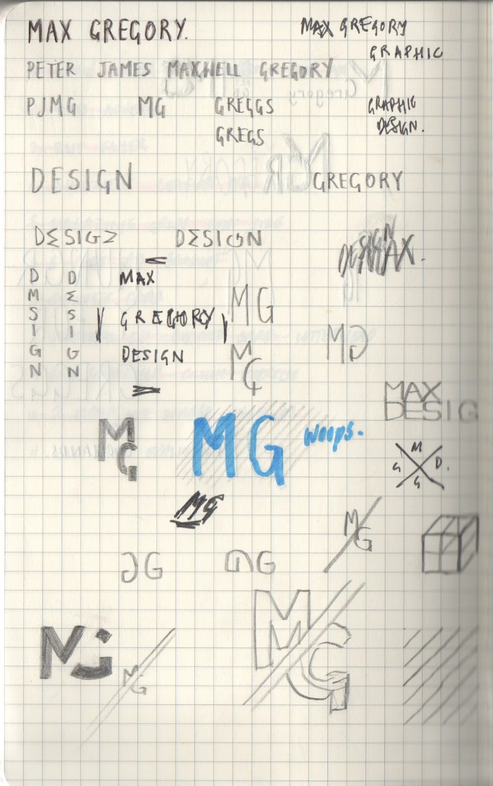
So I began as simply as possible, using my name in order to create some kind of logo.  Below are some initial sketches from my notebook in which I looked at the use of letters within my name that gave good visuals when placed together. I also looked at playing with the letters in the word design in order to make them read as design but make out the initals of my name. There were a few avenues from these sketches that I thought could be interesting to follow so I then moved over to digital.


My initial experimentation revolved around the word design, as I thought that turning the M as my first inital could look like an E in the word design. It was then a case of using the word in a way that could pick out my initials from the rest of the letters. This involved looking at the orientation and use of colour.  felt these were OK, but I wanted something much simpler that still had the same effect.
Above were variations in a logotype that I worked on taking my initals and joining them to create something interesting visually. The first is a very convoluted example, however the second I think is much improved, simplified, using a diagonal split between the M & G and matching the letters along the diagonal of the M. I was very pleased with this example but moved on looking and ways of simplifing it further to give a much smaller impression on the page but keeping the same effect.

However the more I looked at this logo, the more I realised I didn't want a logo. although it could be applied to my branding, I feel that I am not a designer that wants to focus on logo, and the development of a logotype for myself would be much more reflective of my own practice.


 Although very simple, I felt the above examples were the best and most reflective of my own design. Since writing about Swiss design for my CTS I have become very interested in the international typographic style and feel that knowing so much about their practice has had an effect on my own. This is where the inspiration for a few of these examples is drawn from, however I didn't want to come across as a designer that only does this kind of design, so keeping it neutral and simple gives both the modernist and flexible sides.