6.04.2012

Because folio

Task 3
Because - folio 01
Paper portfolio.

Simple portfolio produced by Because studio that shows potential clients the work they've produced. Letting them know exactly how they work. This kind of portfolio is ideal for mailing out as it provides a cheaper alternative to the expensive, presentation portfolios often produced by students. 


Strengths : Really targets potential client base and provides alternative to expensive portfolios that don't have the ability to be mailed out.

Weaknesses : Although cheaper than a presentation portfolio could still be a rather expensive item to produce on mass in full colour in order to mail out to potential employers.

Opportunities : Provides opportunity for work and gives a good basis for further work.

Threats : mail out format means it could not be received by the intended client and could also not be read properly.

Soyoung Han portfolio pack.

Task 3
Soyoung Han 
Portfolio Pack 


Portfolio pack designed I'd guess to be sent to studios or used at an exhibition or end of year event. A lot of elements to this pack that although very descriptive as a whole and visually attractive, may go overlooked and will also be very expensive to produce. A lot of work has clearly gone into the production of this, at the expense of time and money.


Full pack :
book
postcards
Report/CV
Bag
Business cards 


Portfolio Book


Report


Strengths : Could be brilliant visually aswell as give a really great view to potential clients or employers, exactly the type of designer you are.

Weaknesses : Expensive to produce and even more so to mail out to a number of different studios. Also makes it rather difficult to tailor to each studio.

Opportunities : Provides opportunity for work/collaboration and gives a good basis for further work.

Threats : possible that people receiving this don't read it all as there is a lot to look at. maybe more to the point.

Branding Ideas. Logo development

This was a process I wasn't particularly excited to begin, because although it is very important in the development of a professional appearance for any designer, it was something I had stumbled on many times before. I've heard many people say (including John) that branding yourself is one of the hardest things you could do as a designer and previous excursions into this area had proved this.

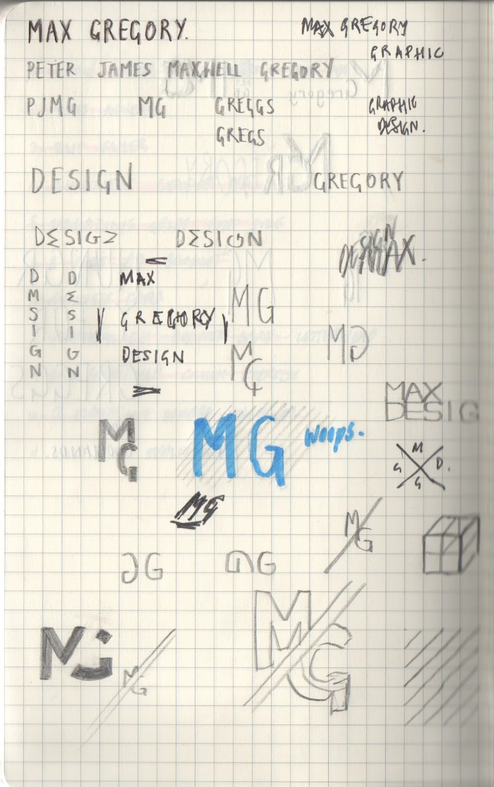
So I began as simply as possible, using my name in order to create some kind of logo.  Below are some initial sketches from my notebook in which I looked at the use of letters within my name that gave good visuals when placed together. I also looked at playing with the letters in the word design in order to make them read as design but make out the initals of my name. There were a few avenues from these sketches that I thought could be interesting to follow so I then moved over to digital.


My initial experimentation revolved around the word design, as I thought that turning the M as my first inital could look like an E in the word design. It was then a case of using the word in a way that could pick out my initials from the rest of the letters. This involved looking at the orientation and use of colour.  felt these were OK, but I wanted something much simpler that still had the same effect.
Above were variations in a logotype that I worked on taking my initals and joining them to create something interesting visually. The first is a very convoluted example, however the second I think is much improved, simplified, using a diagonal split between the M & G and matching the letters along the diagonal of the M. I was very pleased with this example but moved on looking and ways of simplifing it further to give a much smaller impression on the page but keeping the same effect.

However the more I looked at this logo, the more I realised I didn't want a logo. although it could be applied to my branding, I feel that I am not a designer that wants to focus on logo, and the development of a logotype for myself would be much more reflective of my own practice.


 Although very simple, I felt the above examples were the best and most reflective of my own design. Since writing about Swiss design for my CTS I have become very interested in the international typographic style and feel that knowing so much about their practice has had an effect on my own. This is where the inspiration for a few of these examples is drawn from, however I didn't want to come across as a designer that only does this kind of design, so keeping it neutral and simple gives both the modernist and flexible sides.


Business card Inspiration

Jan Vranovský
Vrrb interactive 
Logotype & visual Identity.


5.17.2012

Super script.


Really nice piece by by French studio Superscript outlining an identity for Looking for Architects agency. Although it may not be entirely relevant and it is only showing typefaces used for a visual identity, I love the aesthetic of this piece and it's very much like I may want a mail out to look. I particularly like that it could work in so many colour ways due to it being produced using only black type.

5.08.2012

Triboro - N/A identity

Triboro 
N/A Identity 
print collateral and web


This identity caught my eye whilst browsing Triboro's website and I'm not entirely sure why. I think the official appearace of the business cards and stationary work really nicely and surprisingly, translate really well to web. I also like how the website makes use of much bolder, photographic imagery to contrast the feel created by the stationary. I also think that the changeable nature of the business cards could be really interesting, they look to me as if they are created using a stamp, which could be changed should any details need to be changed, it's nice that there are also variations of business cards, so you'd feel more special receiving one...

4.25.2012

Pete Rossi

Pete Rossi
Visual identities
Graphic designer, visual artist and maker of things, Pete Rossi. His passions lie within Crafting intelligent — ideas based solutions, Typography, Identity, Branding, Editorial & Book design, Art and cultural issues. He is a firm believer in pushing boundaries within every creative avenue he seeks.