Brief title.
- YCN Competition Brief
Why have you chosen to work with your creative partner? what are your aims?
I chose to work with Matt because I felt that my skill set complemented,
if not matched, the skills that he outlined for his creative partner. I
was also drawn to the design of his sheets and felt that his image base
and skills with software and colour would prove beneficial overall.
What are your specific areas of creative interest in this brief?
I'd very much like to go back to working with print, and although not
massively in favour of a packaging brief, I'm open to the possibilities
that arise from this collaboration and don't want to disregard an
opportunity. I also see this as a good opportunity to learn from my
partner, especially in terms of colour, because I think Matts grasp is
much better than mine.
What specific design skills do you have to offer in relation to your collaboration? How do you intend to use them?
I feel as a designer I am based very much around type & layout and
also the physicality of print. So I think I could bring typographic
knowledge and a meticulous approach towards the outcome to the creative
table... I am very interested in printed finish, in terms of stock and
special print so I think this could also be useful in the collaboration.
What non-specific skills do you offer in relation to your collaboration? How do you intend to use them?
In terms of non specific skills, I think i can bring meticulous
attention to detail and the process of producing work. Also along with
this comes a hatred of spelling and grammatical errors so proofing etc
is not a problem, which I think will be particularly useful in this
collaboration. Also over the past few months I've become much more
organised and feel an improved work ethic and use of time management
will benefit the collaboration.
What will your specific roles be in the collaboration?
I think within the collaboration I'd take a slightly more organisational
role as well as print based designer, working off screen in terms of
print finish.
What will your individual responsibilities be in relation to your collaboration?
- As mentioned previously, I'd like to go back to working with print so
designing with this in mind would be one of my key responsibilities.
- I would probably focus on typographic elements of the designs, working very much with the skills learnt in the type module.
- Attention to detail.
What will our joint responsibilities be?
Joint responsibilities will probably be building of concept and a share in the overall design duties.

3.21.2012
3.07.2012
3.06.2012
Enterprise - Craft - Business Plan
Document laid out by Joe using everyone's collected work in the format of a business plan.
Revised business plan.
Revised business plan.
This is a revised business plan with additional information with regards to finance and accounts.
Enterprise - Craft - Paper portfolio photos

The portfolio and business card together in a plastic wallet.

The two separate elements
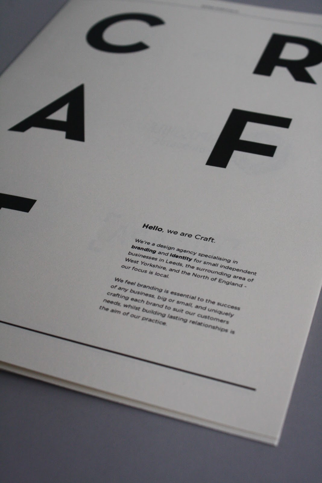
Portfolio cover detail.
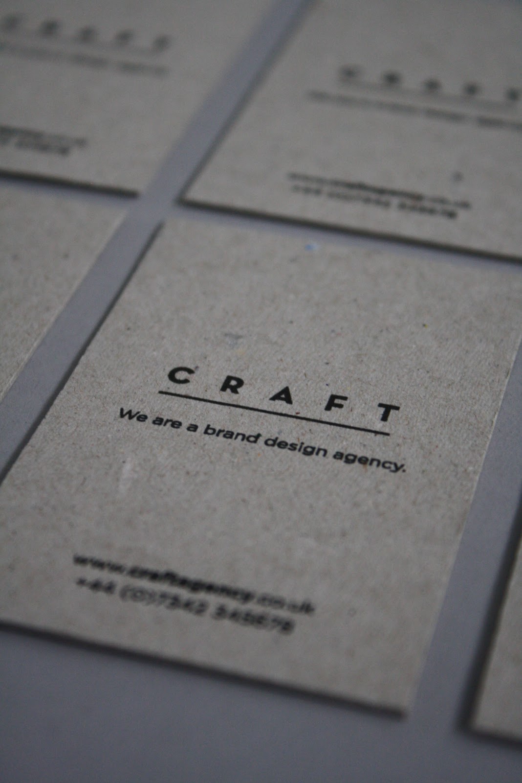
Business card detail.


Paper portfolio spreads.

Back cover.
Enterprise - Craft - paper portfolio
The paper portfolio handout that we created for the enterprise presentations as a promotional/informational device for our business, Craft.
3.02.2012
Rob Van Hoesel
A designer based in the Netherlands that I came across whilst browsing a creative blog. Really like the work he produces, someone I'd be very interested in contacting despite being based in the Netherlands.
Publication
Spaces and Places in between
Publication, poster and CD


 A music based publication produced as a pack with a CD and trace printed poster. Really like the format used for the presentation of this publication and the use of type. Using the poster as a form of packaging, keeping the booklet and CD together is really interesting and the way the design on the trace interacts with the design beneath it on the cover of the book creates a really interesting aesthetic. The publication contains some really simple layouts with only a few hundred words and an image but it seems to work really well.
Identity
Graphic Design Festival, Breda
Identity, catalogue and event promo


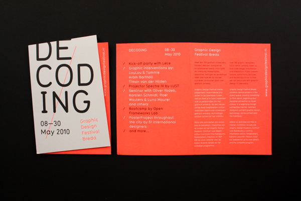
 Identity and catalogue for a graphic design festival in the Netherlands. Really strong yet incredibly simple visual mark, with an aesthetic running across all media. Love the use of the fold for the cover of the publications conextualising the mark and creating an interesting difference throughout the entire identity.
Dieuwertje Komen
Identity


Really simple identity for a photographer using a shape based around the negatives and visualisation of the photographers work. Again really simple but effective, colours used to give a slightly more feminine feel to the overall identity due to the photographer being female.
Publication
Spaces and Places in between
Publication, poster and CD


Identity
Graphic Design Festival, Breda
Identity, catalogue and event promo




Dieuwertje Komen
Identity


Really simple identity for a photographer using a shape based around the negatives and visualisation of the photographers work. Again really simple but effective, colours used to give a slightly more feminine feel to the overall identity due to the photographer being female.
Enterprise - Craft - The presentation.
Slides from the final presentation that Charlotte and Luke expertly delivered while Joe and I cowered in the corner and handed out paper portfolios. The design of the slides was done as a group as they came about from the culmination of every ones separate efforts into researching the business.
Subscribe to:
Posts (Atom)